- Team
- Senior UX Consultant (myself)
- Junior UX designer
- Lead Softwere Engineer
- Chief Technology Officer
- Techniques
- Mockups
- Prototypes
- Analytics
- Competitive research
- Usability testing
- Design workshops
Objective
Bell Potter, a stalwart in the Australian financial landscape since 1970 and a proud member of the Bell Financial Group, is set to revolutionize its in-house advisory software. The mission is clear: create a single, efficient web app to replace outdated systems. This bold vision, fully endorsed by Bell Potter's senior management, heralds a new era of streamlined and impactful financial advisory services.
By unifying and refining the overall experience for financial advisors, Bell Potter aims to shift time away from administrative compliance tasks, allowing advisors to better serve their clients with a comprehensive financial product line. The consolidation of their multiple app ecosystem, combined with time savings and error reduction, is projected to save $2 million annually.
As a team, we aimed to establish a clear UX strategy and solid design principles to deliver a product vision that would reward Bell Potter with a promising ROI.
Challenges
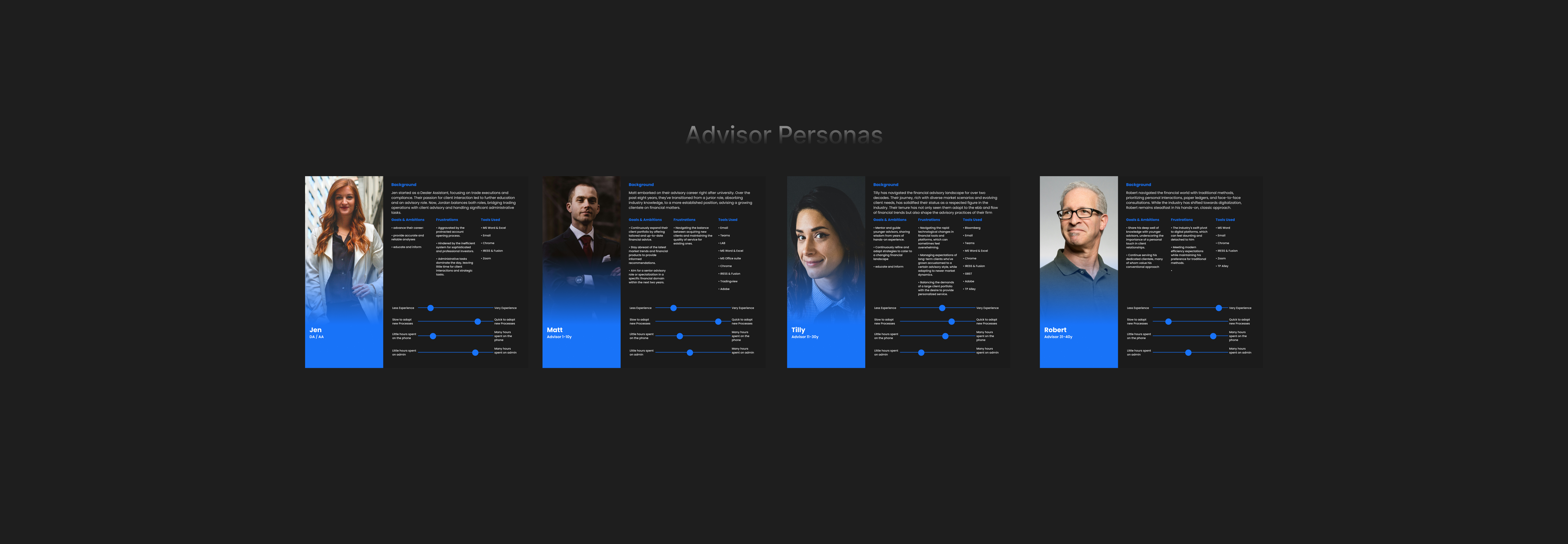
The journey to transformation was not without its hurdles. Advisors, accustomed to the current system through years of use, were naturally resistant to change. This resistance was compounded by a user base diverse in roles, ages, and work styles, each with unique approaches and behaviors to consider in the UX design.
The financial advisor industry is heavily regulated, with advisors spending a significant portion of their time on administrative tasks to ensure compliance. The challenge was to reduce this administrative burden, enabling advisors to devote more time to client services and uncover new financial opportunities.
Approach
Our approach began with deep research and collaboration. We leveraged previous UX session interviews and partnered closely with Bell Potter's team, who were eager to integrate proper UX practices. By compiling all available research and insights, we employed solution trees to map out customer needs and devise potential solutions.
Additionally, we conducted an exhaustive competitor analysis to pinpoint market opportunities and leverage industry trends and experiences. This analysis provided a clear understanding of competitor offerings and inspired innovative enhancements.
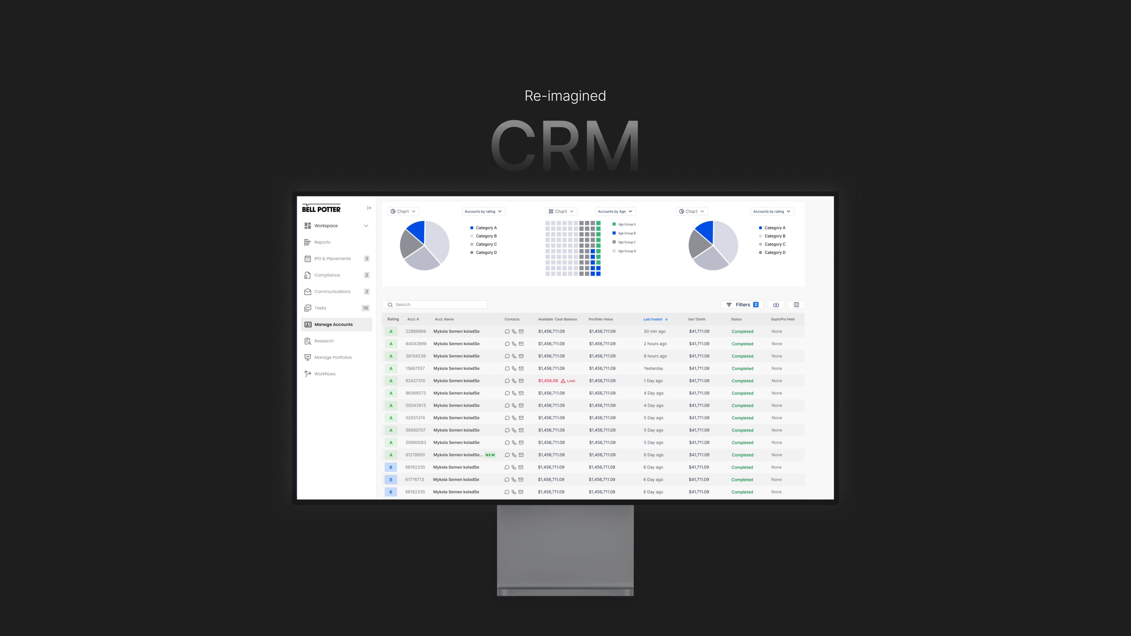
To directly capture problems and solutions from advisors and stakeholders, we conducted a co-design workshop. This collaborative effort allowed us to prioritize the most valuable features for the Minimum Viable Product (MVP). Armed with these insights, I developed mockup design solutions for prototyping and user testing.
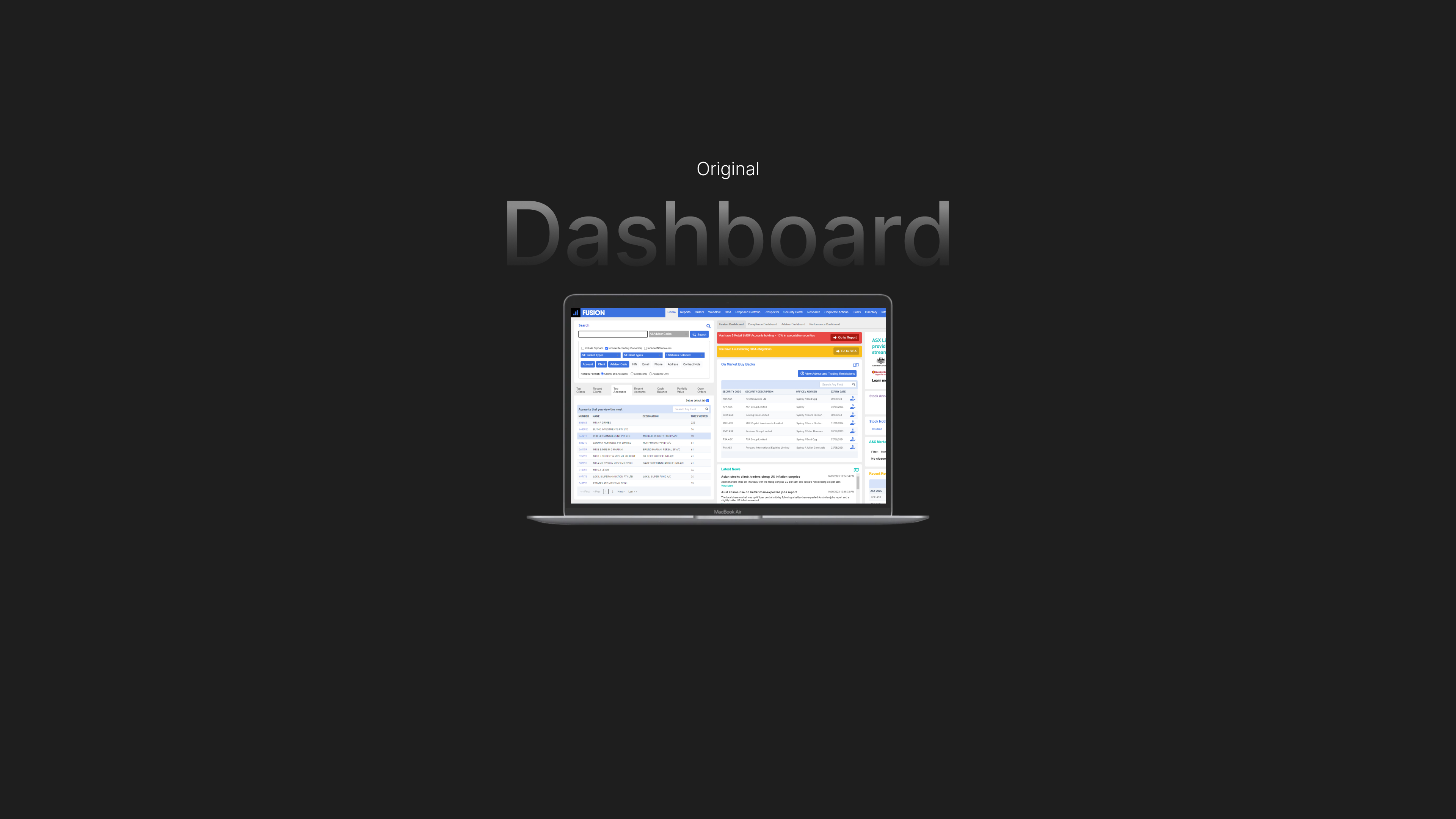


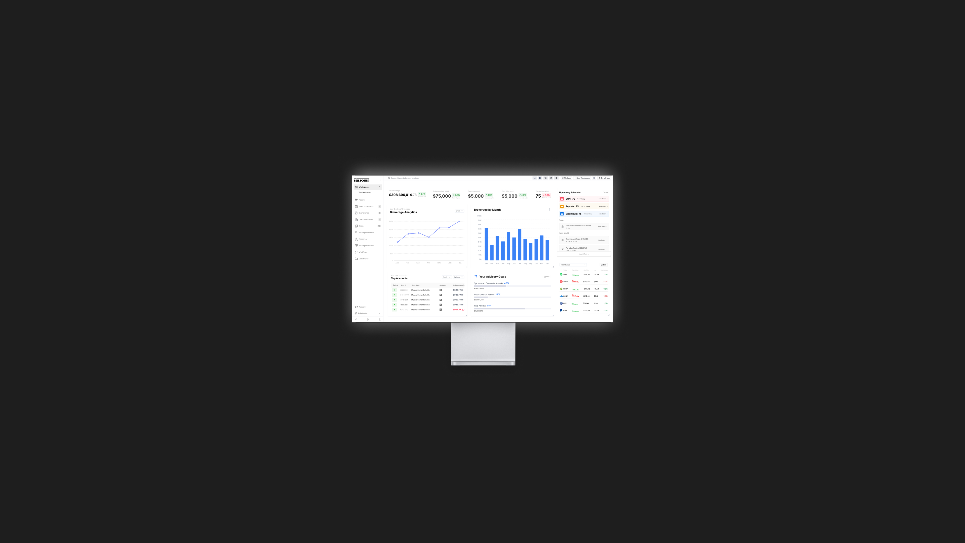
We designed an advisor experience that consolidated core product features into one central app for streamlined operations. Advisors no longer need to traverse back and forth between client information, research, order management, and other tasks.
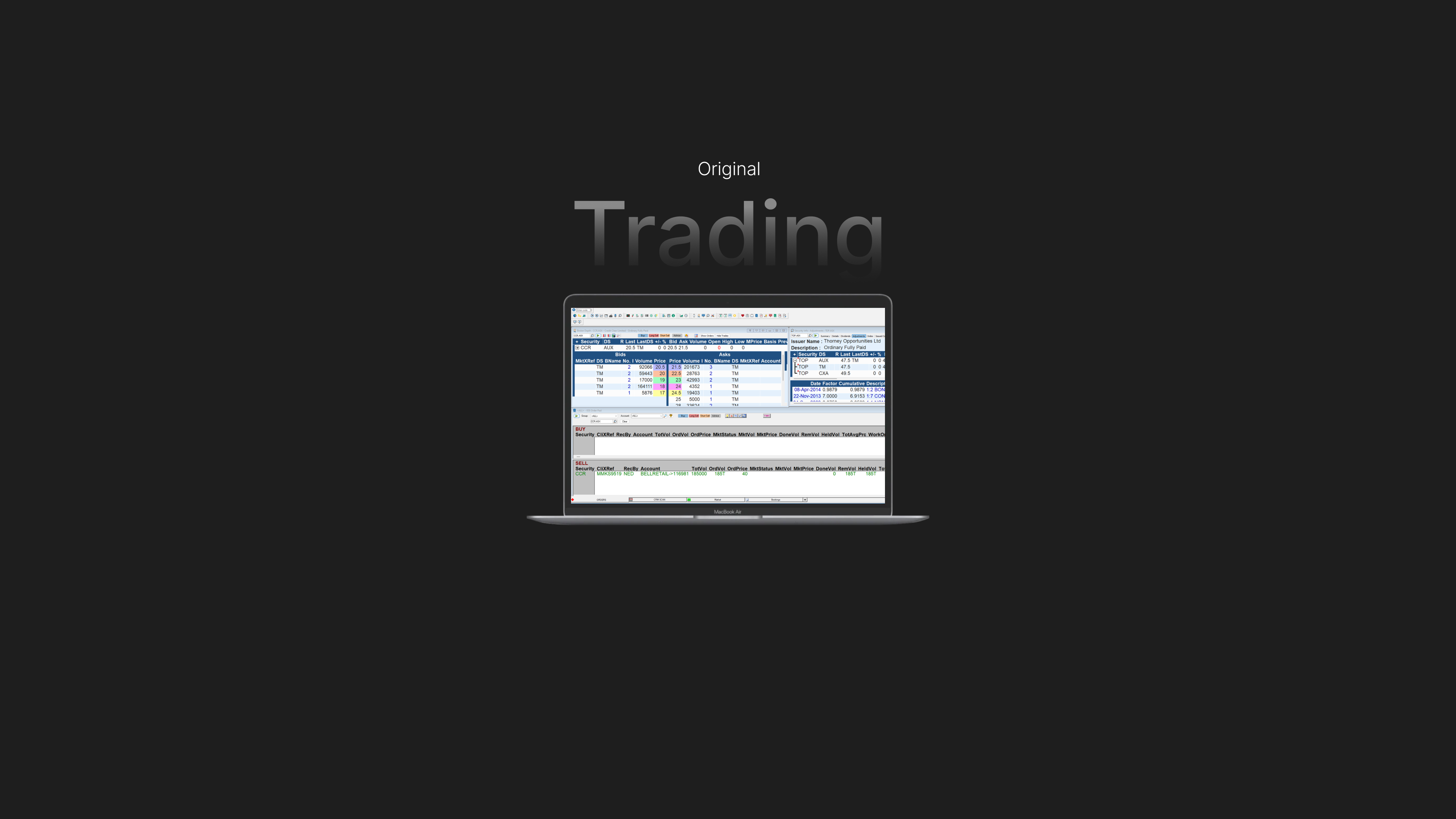
We unified foreign trading capabilities within a single application, enhancing global ease of use. Additionally, we crafted new features that resonate with business objectives, ensuring strategic coherence throughout the app.
Advisor-centric features were developed to significantly reduce administrative time and minimize errors, allowing advisors to focus more on their clients and less on tedious tasks.


Outcomes
Moderated user interview testing with a clickable prototype of the MVP delivered promising results. By incorporating familiar design elements from the existing software and insights from competitors, the prototype resonated well with advisors, who responded positively to its familiarity and improved functionality.
The redesigned product demonstrated significant gains in performance and advisor satisfaction. Eliminating reliance on the competitor’s product led to an annual saving of $2 million. Our user-centered approach facilitated smoother adoption of the new platform, catering to both change-resistant and tech-savvy advisors.
While the overall results indicated that the UX was on the right track, the next steps involve further testing of individual modules within the new web app. These modules, functioning as mini-apps within the web app, are the workhorses that can be mixed and matched to create a customized advisory experience.
The project successfully addressed the diverse roles, ages, and work styles of the advisor audience, ensuring a tailored and inclusive user experience. Streamlined administrative processes reduced the time advisors spent on compliance tasks, allowing them to focus more on advising clients and exploring new financial opportunities.
The competitor analysis provided valuable market insights, enabling us to create a more competitive and innovative product. Ultimately, the project fostered a cultural shift within Bell Potter, embedding proper UX practices into their development process and setting a new standard for user-centered design initiatives.