C.H.A.R.T.S.
-
ClientAerial V
-
RoleSenior Product Designer
- Team
- Senior Product Designer (myself)
- Junior Product designer
- Lead Software Engineer
- Techniques
- Mockups
- Prototypes
- Analytics
- Competitive research
- Usability testing
- Design workshops
Objective
The objective of this project is to craft a platform that transforms how financial advisors on FinTwit connect with their audience. Our mission is to empower these advisors with tools and resources that distill complex financial concepts into clear, compelling narratives. By simplifying the intricate, we enable advisors to communicate with precision and impact, elevating their ability to educate, engage, and inspire their followers. This platform isn’t just a tool—it’s a catalyst for deeper connections and more meaningful financial conversations.
Challenges
At the heart of this project lies a bold objective: to craft an application interface that intuitively guides users in creating animated data outputs. This isn’t just about functionality—it’s about delivering content that’s as compelling as it is informative. Our goal is to ensure that every piece of output is not only well-designed and visually captivating but also effortless to watch, transforming complex financial information into a narrative that resonates with the audience.
Yet, achieving this vision comes with its challenges. Financial data can be conveyed in countless ways, each with its own intricacies and nuances. The real test is in how we incorporate annotations within these charts—ensuring the message is clear without overwhelming the visual presentation. Moreover, we’re operating within the constraints of Twitter’s video requirements, which dictate the length and format of the content we can share. Navigating these limitations while staying true to our vision is where the real artistry lies.
Approach
Our secondary research revealed a powerful insight: videos are not just a medium but a magnet for capturing and retaining audience attention. Backed by studies from Harvard and MIT, we know that the most memorable visualizations are those that embrace embellishments, vibrant colors, and rich visual densities. When we pair this with the audience's clear preference for video content, it becomes evident that animated videos of graphed data are not just an option—they’re a necessity.
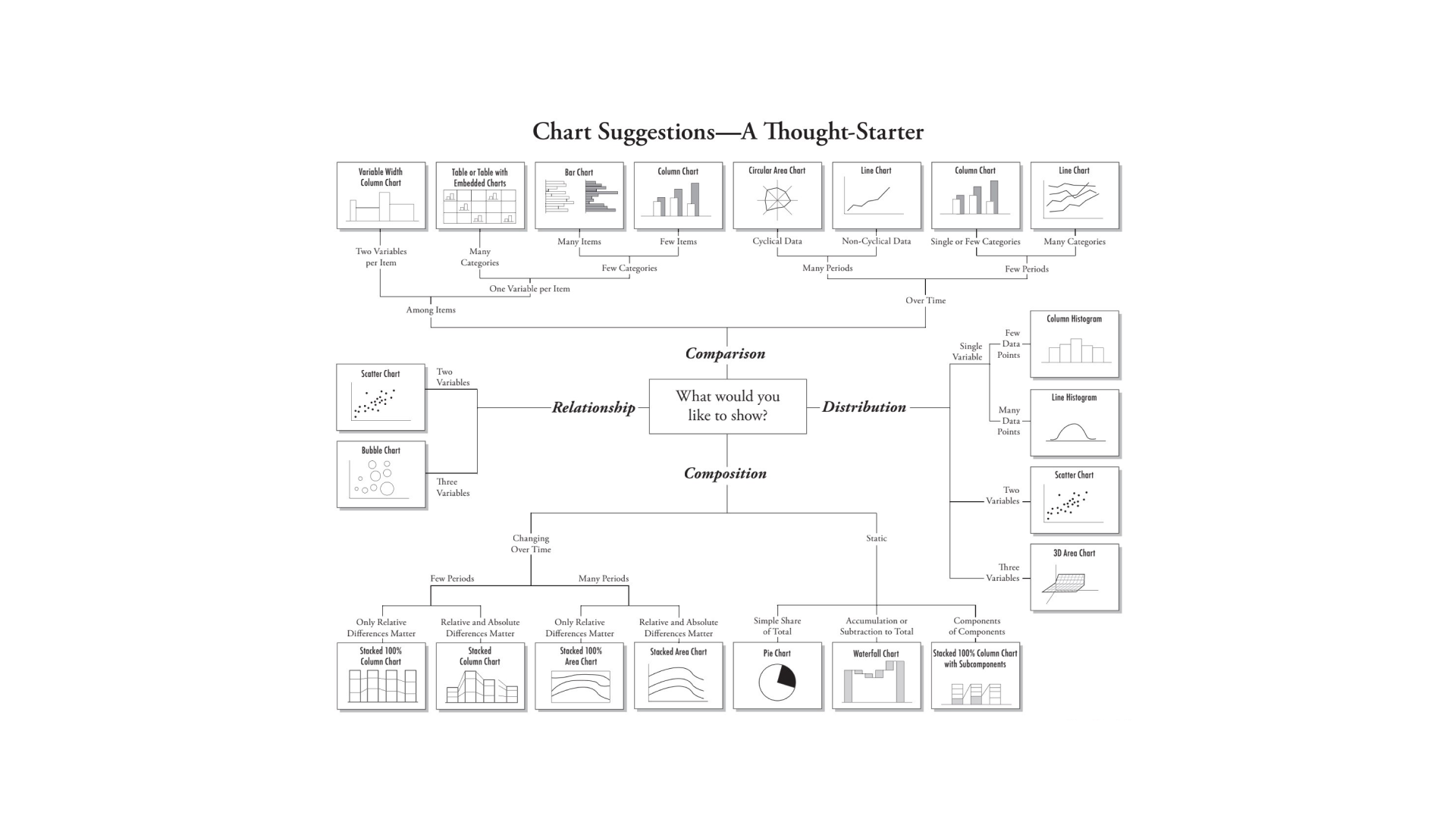
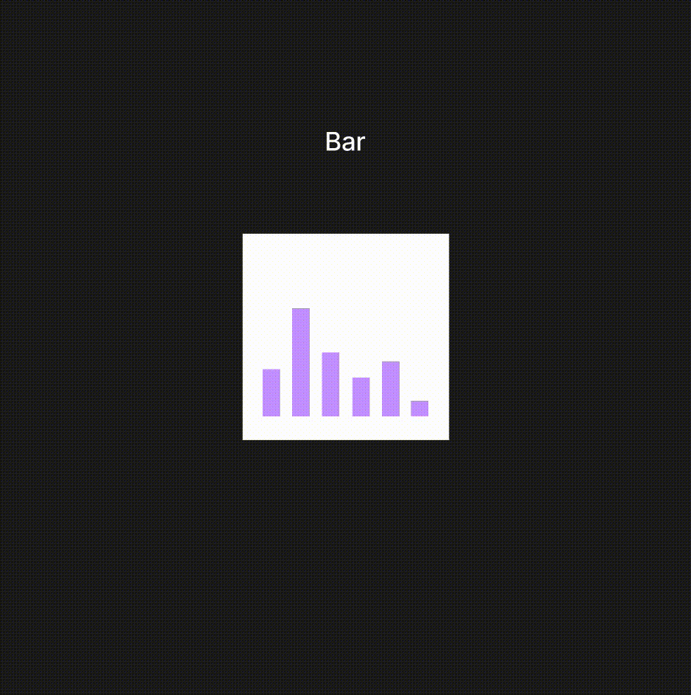
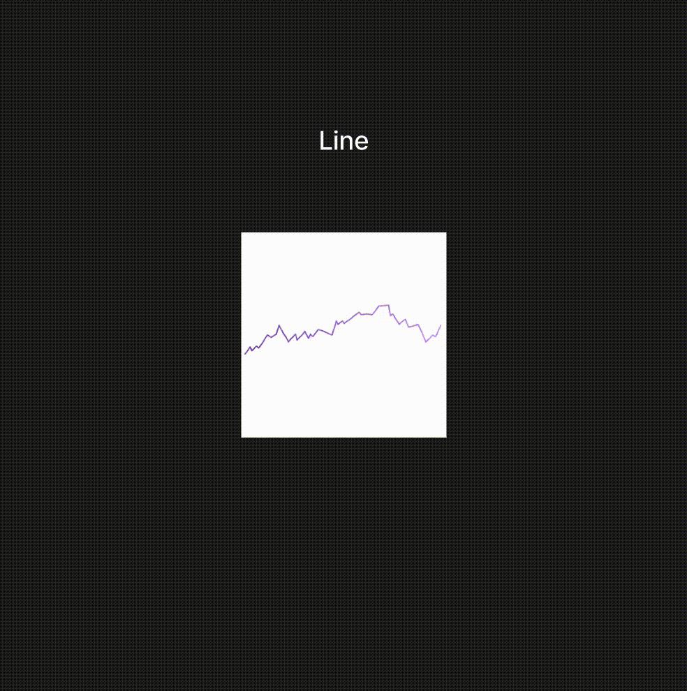
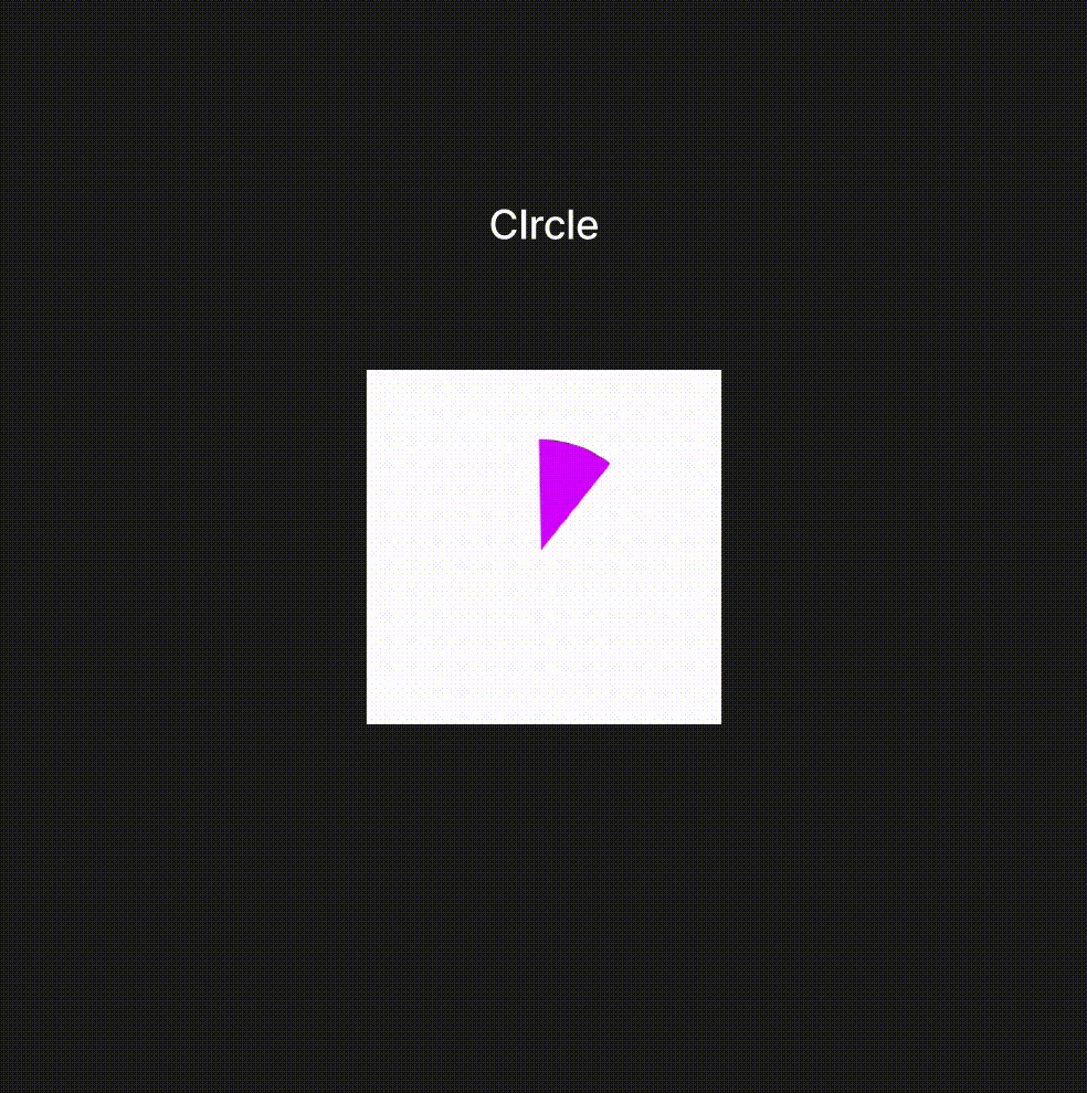
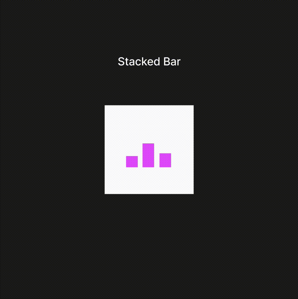
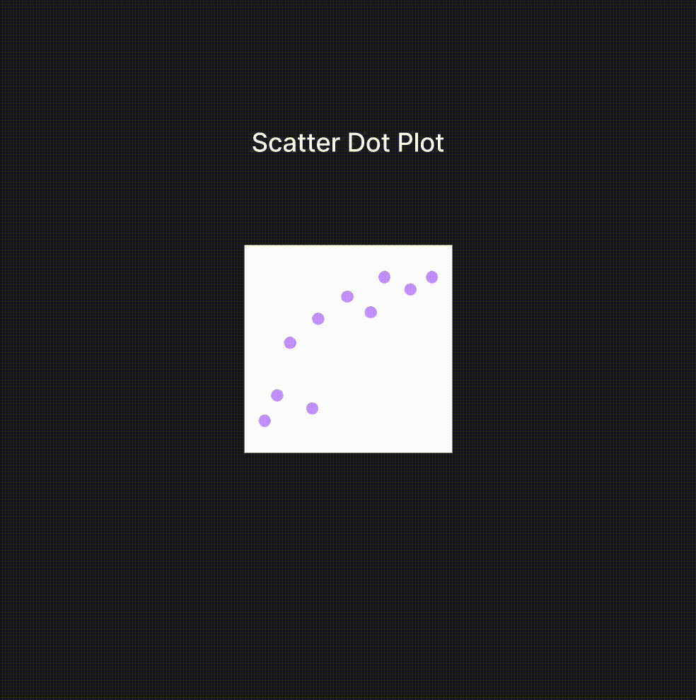
To maximize impact and usability, we focused our efforts on the chart types that truly resonate: bar, line, circle, scatter, stacked bar, and square-area charts. These are the visual tools that advisors turn to time and again, and we ensured they were at the heart of our design strategy.
But we didn’t stop there. To deepen comprehension and retention, we employed progressive disclosure, a method that breaks down complex data into digestible, sequential segments. This approach empowers the audience to grasp the message with clarity, ensuring that key insights are not just understood but remembered.

To bring this vision to life, we developed a prototype and put it to the ultimate test—real user feedback. Through an iterative process of user testing, we fine-tuned our solution, ensuring that every animated video not only communicated complex financial ideas with clarity but also captivated and engaged the audience at every turn.
Outcomes
While our pursuit of motion video and the engagement of our approach were validated through user testing, new insights emerged. One key realization was the expectation of sound accompanying the videos, enhancing both understanding and engagement. Another crucial discovery was the importance of text animation speed—striking the right balance is essential to maintain readability without losing the audience's attention. These findings have illuminated additional elements that must be woven into future iterations and testing, guiding the ongoing refinement of our platform to better align with user expectations and needs.
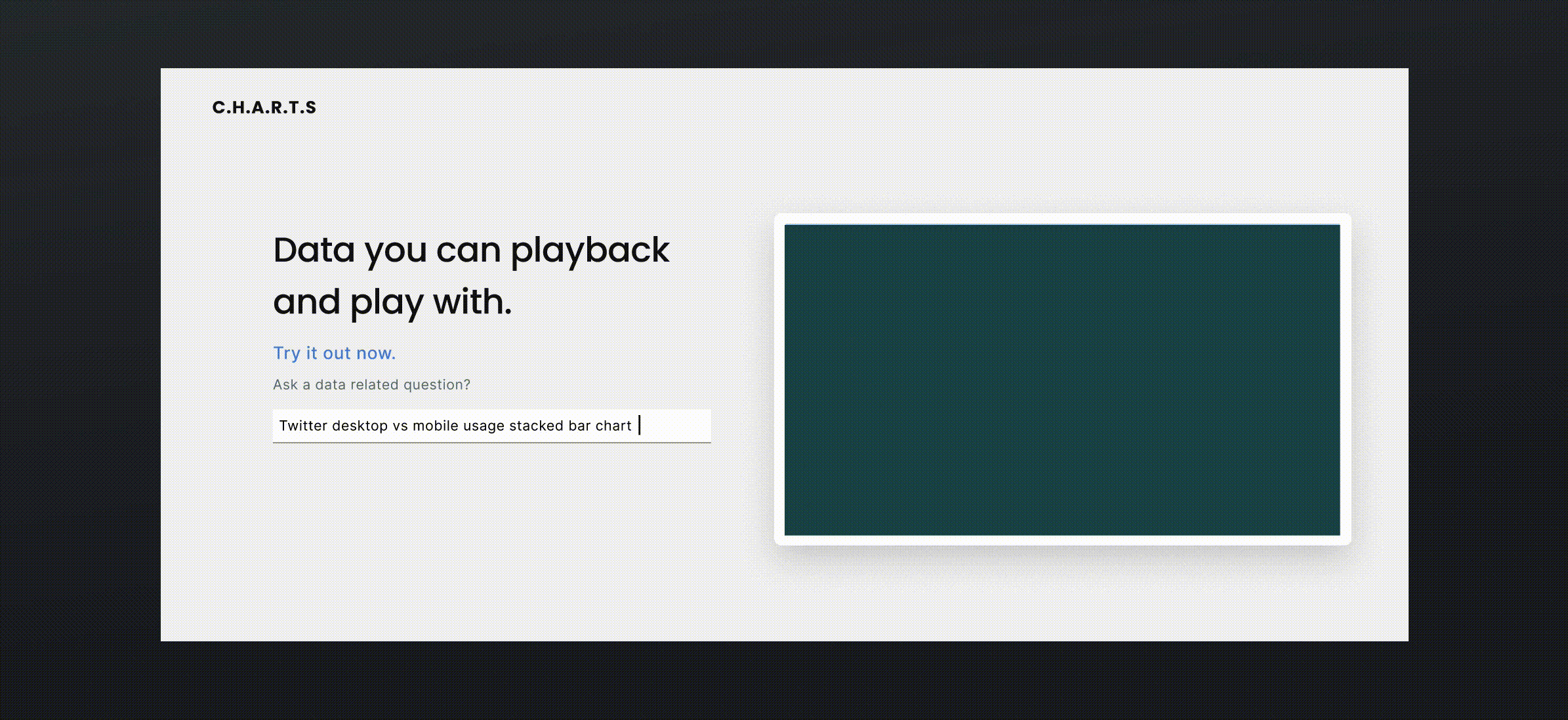
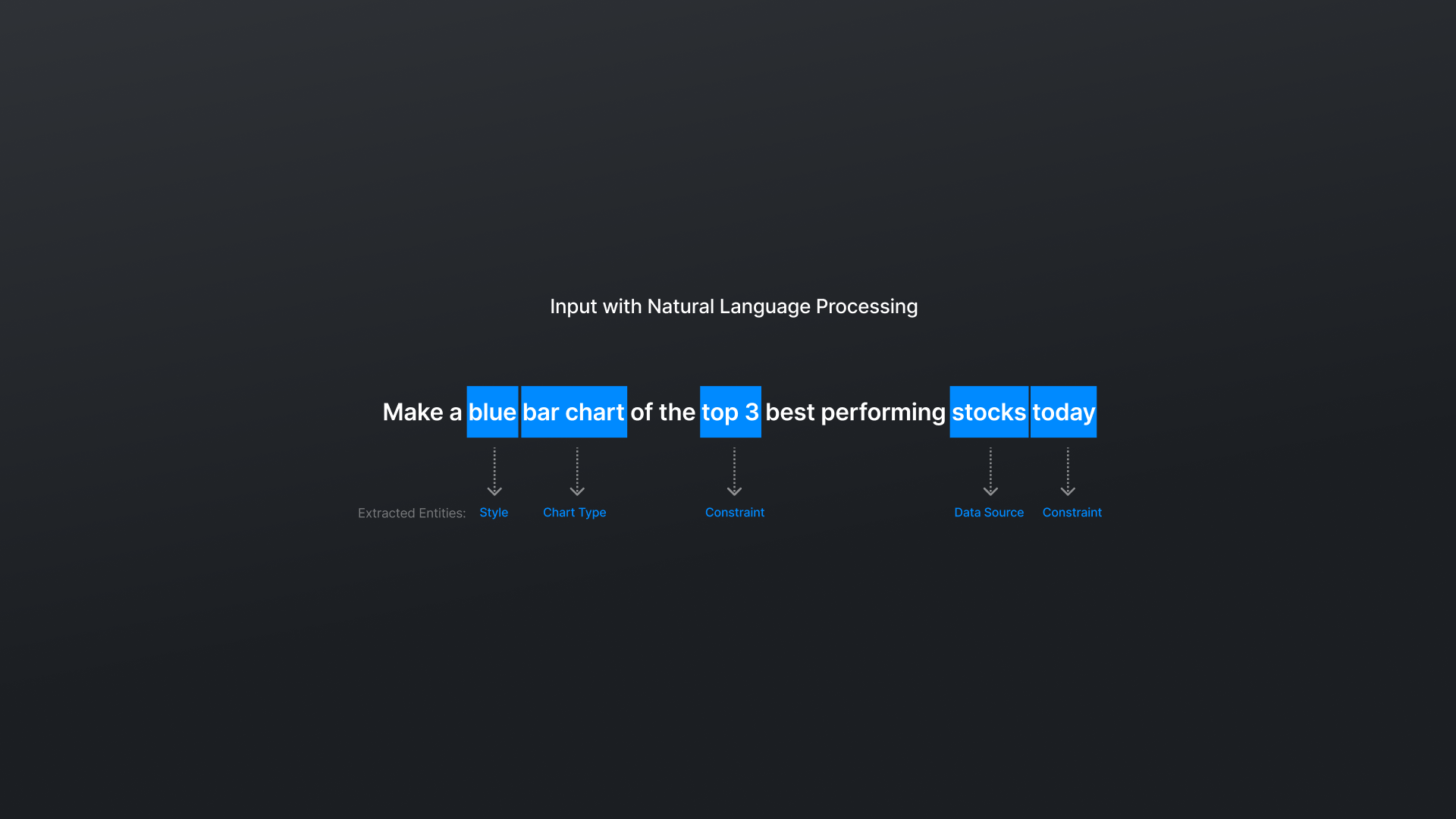
As we look ahead, we recognize that an extensive list of data source options can lead to long, cumbersome menus, detracting from the user experience. To combat this, we’ve embraced Natural Language Processing (NLP), a sophisticated branch of AI that transforms text into actionable data by enabling computers to comprehend and respond to both speech and text. By understanding the context and intent behind user inputs, NLP empowers systems to anticipate and fulfill user needs with remarkable precision.
Rather than navigating through complex data menus, users will interact with the system in a way that feels intuitive and familiar. Our approach leverages NLP techniques such as entity recognition and intent classification to help users create animated charts. By training a model to recognize keywords related to chart types (e.g., "bar chart," "line graph") and data sources (e.g., "CSV file," "database"), we are crafting an interface where specific natural language inputs seamlessly map to the appropriate charts and datasets, streamlining the entire user experience.
However, as we integrate NLP into the web app, further research is essential—particularly in the area of error handling. Prioritizing error management is critical to ensure accurate and reliable outputs, enhance the user experience, maintain trust, and prevent the spread of incorrect information. It’s through this meticulous attention to detail that we will continue to elevate our platform, ensuring it meets the highest standards of excellence.